How To Design Flyers Using Figma, Learn Step-By-Step
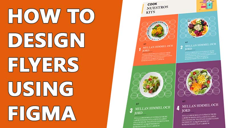
From the very beginning, Figma is helping its users and attracted even more people by making designing a lot easier. You can create almost any type of digital design using Figma. And when it comes to business promotion, Figma has tons of templates and resources that you can use. Learn how to design flyers using Figma that will make your business promotion even more successful.
For both online and offline connections, flyers play an important role. There are multiple designs for flyers that are very different from each other. You can design different types of flyers using Figma and use that design for any purpose. So, without any further distraction, let’s dive into it.
How To Design Flyers Using Figma
Designing professional flyers in Figma is quite easy. Numerous Figma flyers templates will give you the visual idea for your flyer. You can also choose your flyer size in Figma. The options are unlimited. I’ve explained my steps to design flyers in Figma here.
Choose the Design You Wants To Follow
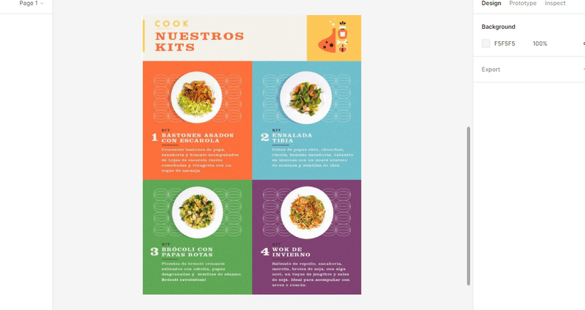
There is no strict size of the Figma flyer dimension. Usually, flyers are made in a rectangle shape. But you can create a square-shaped flyer if you want. I have seen some flyers with unique shapes as well. You will find different Figma flyers template on the internet. Choose the most suitable one or the one you want to copy or get inspiration from. You can also use multiple flyers and combine their elements to create your design.
Import The Design In Figma File
After you choose your design, import the design into your Figma file so that you won’t need to jump from one tab to another while designing. The design can be in JPG PNG or SVG form.
Create The Frame
The first thing you need for your design is a frame. The frame will hold all the elements and give the flyer its shape. I have used a 1200 X 800 pixels frame for my flyer design.
Create The Background
After creating the frame, you need to create the background. You can use a single shape or multiple shapes to make the background to your liking. I have used six rectangles to divide the frame.
Add Details
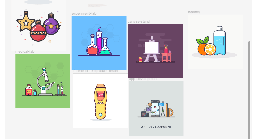
Only using some background patterns might look bland and make your frame unattractive. You can use different illustration graphics and elaborate other elements in your design.
Include Contents
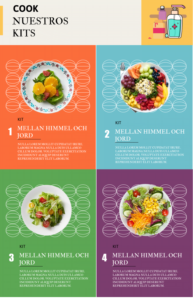
After creating the design, it’s time to include the information and contents that you want to show your customers. You can use creative designs to make your elements blend with the background. You can also use designs that highlight your content. Include your contents however you see fit. There are no hard and fast rules that you must follow.

Align And Scale The Elements
After adding all the elements, it’s time to align them and look at the whole frame. You can resize your elements and place them to make your flyer more attractive.
Finalize Your Design And Save
After scaling, you are done with the designing of your flyer. While reviewing the design to finalize, you can also change, add or delete elements. After checking the elements and the entire flyer’s position, you can save the flyer or share it with other people. You can share the Figma file and give access to your team members. If you want to share it with someone not using Figma or a team member, you can save the file in different forms and share it with them separately.
Click on the ‘share’ option at the top right corner of your design. Enter the email address or Figma account name of the person you want your design to share with. You can also save your image from the ‘export’ option and share the saved file from your device.
Tips And Tricks
You need to think outside the box to make your flyer design more relevant and attractive. Here are some tips that will help you make the flyer more useful.
- Stick to your purpose. If your purpose is to promote a discount offer, you cannot follow the design of a restaurant opening flyer. The flyer design varies drastically depending on the purpose of the event.
- Don’t use more than two to three fonts. Using unique fonts surely does make your flyers stand out, but overdoing it can make it look like junk. You can use a single font style with different font sizes. It will still make your flyers stand out while keeping the synchronization. But if you use 6 fonts in one flyer, that hurts the eyes looking at it.
- Choose the color palette wisely. While choosing the colors, make sure they are compatible. Choosing random colors can make your design look ugly.
Conclusion
Understanding the steps and familiarizing yourself with different designs will make your Figma flyer’s design process easier. Create free Figma flyers for your company and enjoy the fruit of your hard work. Learning how to design flyers using Figma can help you to achieve your goal easily. I have this article helps you to make your designing process more comfortable.

