Creating Interactive Carousels in Figma: A Step-by-Step Guide
Carousels, also known as sliders or image rotators, are a popular feature in user interface design. They allow for the display of multiple items in a limited space by showing one item at a time and allowing the user to navigate through the rest of the items by clicking or scrolling. Carousels are commonly used to showcase products, images, or other content in a visually appealing and interactive way.
In this tutorial, we will learn how to create an interactive carousel using Figma’s prototype tool. Figma is a popular design software that allows for the creation of mockups, prototypes, and other design assets. Its prototype feature allows for the creation of interactive elements, such as carousels, through the use of frames, variants, and interactions.
Step 1: Set up the carousel frame
To start, create a new frame in Figma that will serve as the container for the carousel. This frame can be any size and shape, but it is common to use a rectangle that spans the width or height of the design. If desired, you can add a background color or image to the frame to set the visual style for the carousel.
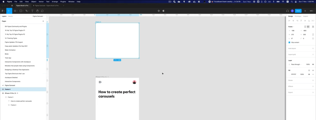
Next, decide on the size and position of the carousel frame based on your desired design. For example, you may want the carousel to take up the entire width of the screen, or you may want it to be positioned at the top or bottom of the screen. Use the alignment and spacing tools in Figma to fine-tune the placement of the frame.
Step 2: Create the carousel items
Now it’s time to create the individual items that will be displayed in the carousel. Create a new frame for each item and add the desired content, such as an image or text. You can use any of Figma’s design tools to customize the appearance of the items.
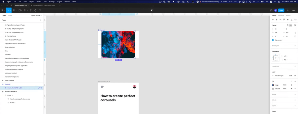
To position the items evenly within the carousel container, use Figma’s auto layout tool. Select all of the carousel item frames and click the “Create Auto Layout” button in the toolbar. Then, use the alignment and spacing options to arrange the items in a grid or other desired layout.
In order to create the animation effect of the carousel, we will need to create two variants for each carousel item: active and inactive. In the active variant, increase the size and opacity of the item to make it stand out. In the inactive variant, decrease the size and decrease the opacity of the item to make it less prominent.
Step 3: Add interactions to the carousel items
Now that we have our carousel items set up, it’s time to add the interactions that will allow the user to scroll through the carousel. To do this, we will use Figma’s prototype tool.
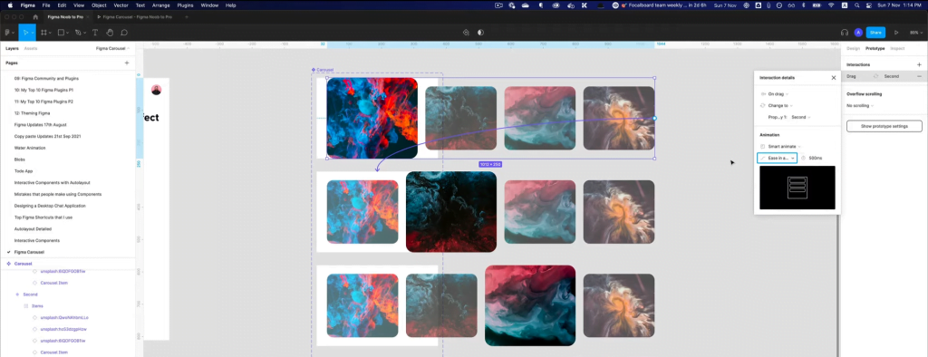
First, select the first carousel item and set its interaction to “On Click.” Then, set the destination frame to be the second carousel item and set the transition to “Instant.” This will cause the second carousel item to instantly replace the first one when the user clicks on the first item.
Repeat this process for all carousel items, connecting each one to the next in the sequence. This will create a chain of interactions that allows the user to scroll through the entire carousel.
Step 4: Test and fine-tune the carousel
Now that you have set up the carousel items and added interactions to transition between them, it’s time to test your work. You can do this by switching to presentation mode in Figma. This will allow you to see how the carousel will look and behave when used by an end user.

While testing, pay attention to the following:
- The transitions between carousel items: Do they feel smooth and natural? Do they take too long or too short to complete?
- The duration of the carousel: Does the carousel move too fast or too slow for your liking?
- The layout of the carousel items: Do the items look balanced and evenly spaced within the container?
If you notice any issues with the carousel, you can fine-tune it by adjusting the animation settings. To do this, go back to the prototype mode and click on the interaction you want to modify. In the interaction details panel, you will see options for adjusting the duration, easing, and other settings. Experiment with these options until you are happy with the result.
Another thing you might want to consider is adding a looping option to the carousel. This will allow the carousel to start over again once the user reaches the end. You can do this by connecting the last carousel item back to the first one.
Finally, you may want to allow the user to scroll through the carousel items manually, rather than relying on the automatic transitions. To do this, you can set the interaction of the carousel items to “On Drag.” This will allow the user to swipe left or right to move between items.
With these steps, you should now have a functional and interactive carousel in Figma. Remember to keep testing and fine-tuning until you are happy with the result.


